Would you believe that people actually read and enjoy reading emails that have good email signatures? It is true that good email signatures can create an impact on your target audience. Now, you might be thinking whether your email signature is good or not, whether it is compelling or not. Well, worry not. I am here to show you what good email signature looks like. I will also give you some examples of bad email signature so that you understand what you should avoid. If you want to know how you can create email signatures that create an impact, check out the article here.
Coming back to where we were. I will give you examples and explain why certain email signatures work and why the others fail. So, let’s not waste any time and get started with the email signature design. I will show you one good example and one bad example so that it’s easier for you to compare them.
GIF email signature:
The first thing that you can do is to create a GIF email signature design. Why would you use a GIF, right? Well, you can include a couple of photos of the products or the service you offer. People who get an email from you can get a glimpse of what you do. The best part about this is that the email doesn’t become heavy since the photos will appear in the form of GIF. Take a look at the email signature below.
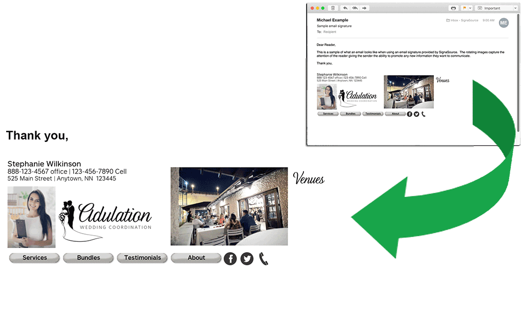
Image courtesy: https://bit.ly/2L4He9g
Here’s one more example that you can take a look at. It’s amazing how delicious the chocolate looks when used in the GIF format. Isn’t it mouthwatering?

Image courtesy: https://bit.ly/2OyLKyZ
Even though I don’t recommend linking all your social media handles in the email signature, the above example is an exceptional. Do you see how seamlessly the social media handles merge in the design? It doesn’t even look like the owner has cramped the space. On the contrary, it appears that you can connect with the owner of the email at different social media platforms.
Besides, you can see all the necessary information placed properly along with an image of the sender. Since the owner of the email signature doesn’t belong to a hardcore professional background, her perky image doesn’t even look out of place.
Image disaster in email signature:
While I just informed you that you can use multiple images (like the images above), make sure that you use the images in the right way. Take a look at the example below and then I will explain you what the problem is and why you should avoid doing the mistake.
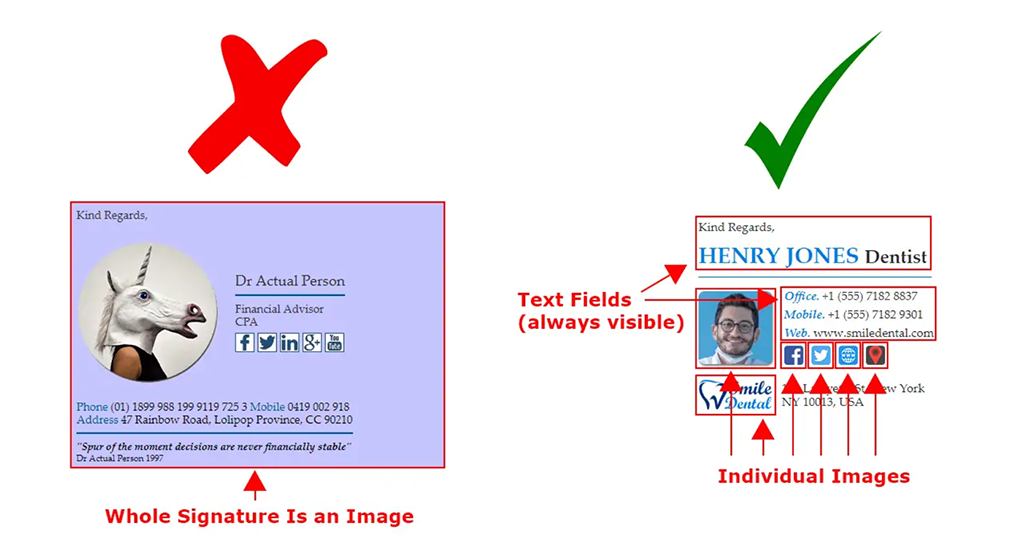
Image courtesy: https://bit.ly/2XZEE9r
There are two images in the above example. While the left (your left hand) image is an image only, the right one is the RIGHT one! Pun intended!
The left side example has all the necessary information in an image form. It seems a good idea, right? Wrong. Why? The first problem with this design is that it may take long to load if the internet connection is poor. So, people may not even get to know whom they are receiving the email from. Besides, it may make the email heavy with an additional image. Secondly, the social media links or the website address that you share in the image form is not clickable. So, if someone liked your email and wants to visit your website, they can’t click on the links. The same problem will occur if someone from your contact list wants to copy paste the name or contact info of your company. Moreover, if you ever need to change anything, whether it is address or the contact number or anything else, you won’t be able to do that. You have to create an all-new image with the new information, which to me is unnecessary time consumption.
So, what is the right way of doing this? Instead of creating an image file with all the information, it is better if you create individual images along with texts. Your headshot should be an image. The social media links that you share should be imposed on individual images so that each of the social media links can be clicked.
However, your name, designation, contact information and other necessary info should be written in text format. It will allow you to change the info quickly and will also allow the recipients to share the information by copy-pasting.
Include images and video links:
You might be thinking that I just told you not to use image in the email signature and now I am asking you to use images. I asked you not to include the essential information in the image format. However, it depends on you whether you want to use images in your signature or not. Suppose you are a photographer or an interior designer or a makeup artist. You can show off some of your outstanding work examples using a couple of images. Don’t use images that are too large to load. Take a look below:

Image courtesy: https://bit.ly/33u9I2t
As you can see, this is an example of an interior designing company. The company shows some of the works that it has done in the past. Since there are images in the email signature, the rest of the design is kept as simple as possible.
You can also share some of your video links. It will work just how you share your social media handles. However, I recommend hiring an email design agency to get a professional design. Let’s see how it will look if you share the links of your videos.

Image courtesy: https://bit.ly/37MHcfD
The images with video symbol are actually nothing but thumbnails. However, each of the images contains the links to the related videos.
Too large social media icon:
Sharing your social media handles is necessary to create an email signature. However, in some cases, you may see that the social media handles are too large. The design not only looks bad but it also doesn’t serve the purpose of being an email signature.

Image courtesy: https://bit.ly/2L4b39M

Image courtesy: https://bit.ly/2Dtlu2w
Your email signature should highlight your name, designation, the name and the logo of the company that you represent. The social media links are secondary. However, creating large social media icons takes away the focal point from the company name and logo.
Short and precise email signature:
Your email signature should never be more than three or four lines. The more precise you can keep it the more attention it will grab. You don’t need to include too much information. Primarily, adding your name, company name, designation, address and phone number is all you need. You can add the address and the phone number in the same line.
You can experiment with the alignment. Keep the logo of the company on the left and the information on the right. You can try out placing the information in such a way that it doesn’t look clumsy and yet all the necessary information can be added. Check out the example below to draw inspiration from it.
Too long signature:
There are some people who like to break the information in multiple lines. While it may seem a good idea, it makes the email signature look too long. Some companies follow the long structure. But I don’t recommend using that structure.
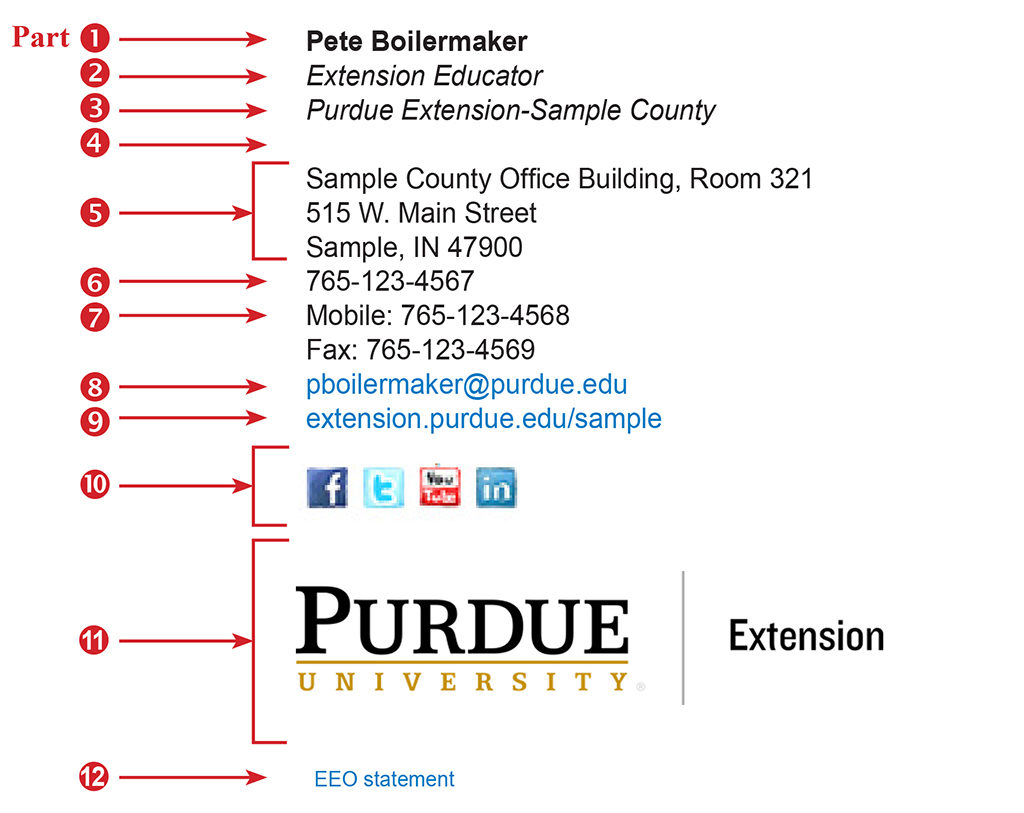
Image courtesy: https://bit.ly/35HCLRB
I agree that the font used is quite big. But even if you reduce the size of the font or you use a different font, the email signature is too long. Just imagine someone reading this in their mobile device! It will be such a pain-stricken situation. If you really need to include so many sections, take idea from the above example. Align the pieces of information in such a way that it doesn’t look too long and yet you can share the necessary info.
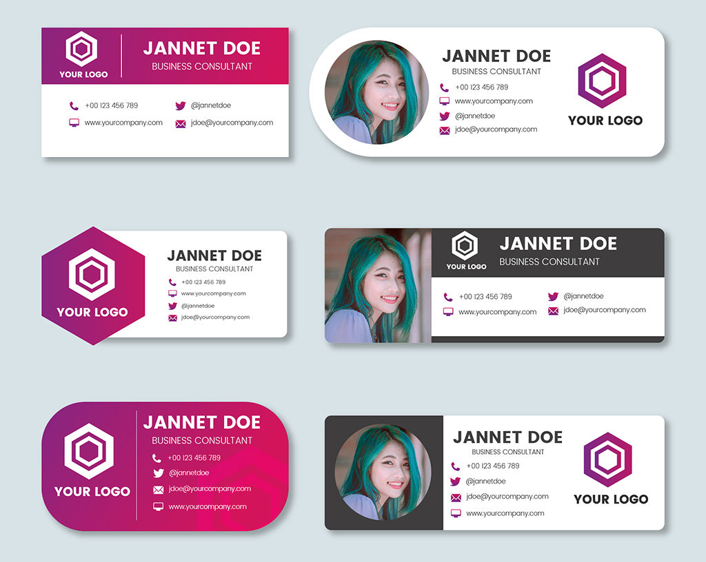
Mobile-friendly design:
Most of us check our emails from our mobile phones or tabs when we are one the go. So, the email signature that you use should be mobile-friendly. By mobile-friendly I mean that it will be short and compact. You don’t have to skip any piece of information and you don’t have to add any additional piece of information.
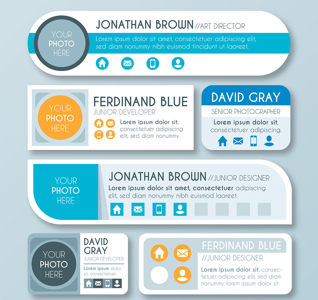
As you can see from the image above, there are multiple ways that you can use to place all the essential information. These are templates that you can follow. Each of the templates is mobile-friendly as they don’t take much space. You can hire a graphic design agency that will help you to create email signature that is good for mobile devices.
Long disclaimer:
I have received many emails from various companies where the disclaimer is placed right below the email signature. Even my own company email signature contains a disclaimer just to make sure that I am legally safe. However, there are some companies that write disclaimers that are too long. In some instances, even copyright information is shared!
Image courtesy: https://bit.ly/2Otjmy3
I agree that the disclaimer helps in keeping legal issues at bay. But you have to understand that disclaimers at the end of your email signature won’t really help you much. So, you don’t need to include all the legal messages in the email signature design. Instead, use a line or two if you really need to include disclaimer. If you don’t want to include disclaimer, that is fine too. You can skip that part.
What is the best way to create email signatures?
You can use the free tools to create an email signature for your personal use or your company. However, the free tools don’t provide a unique finish that you look for. On the other hand, hiring an email signature design agency can give you a professional email signature.
Nico Digital is a full service digital marketing design company that handles any type of design related work. You can be rest assured that your email signature will look classy and will have every piece of information that you want to share. If you have been planning to create an email signature of your own, this is the right time to do so.
One reply on “Examples Of Good And Bad Email Signatures”
I was able to find good advice from your articles.