Categories
Blog

Why Is Corporate Blogging Important For Your Business?

Blogging has been in the business for quite a few years. Even though people started blogging as a medium to share their personal opinion and point of views, soon blogging became an active part of business. However, many business owners either don’t think that blogging can help them in their business or they don’t want to take the stress of creating blogs.

I agree that it is a time consuming process. You have to research on the type of content that you need to create. The articles should be related to your business. You also have to follow certain rules and regulations. The idea is to create content to educate your target audience and to add value to your industry.

However, let me tell you that corporate blogging is one of the best methods to enhance your online presence. If done correctly, corporate blogging can increase the conversion rate and increase your sales so that you start gaining profit. But before getting started with the importance of corporate blogging, you should understand what corporate blogging is.

What is corporate blogging?

In simple words, corporate blogging is creating content that is related to your industry. You have to share your expertise, your experience and give tips about how to succeed in your industry. Creating blogs for your business is also known as content marketing. The primary focus of corporate blogging is to create content on topics that people want to read about.

Are there any guidelines to follow?

Blogging, in general, is very conversational and communicative. No matter what type of business you own, you should connect with people to make sure that they are reading your blogs. The best way to do that is to create blogs that have personal touch in them. Don’t just try to sell your product or service. Instead, educate people on why the product or service is necessary for them. You can give real-life examples to show the importance of the product or service you are writing about.

However, there are a few things that you need to keep in mind. I am chalking down the points that you should remember.

  • You can mention your competitors in a very subtle way. Never criticize the competitors.
  • If you are hiring an employee to write blogs on your behalf, make sure to mention that the opinions shared in the blog should be personal and not official. It means that if you or your employee is creating content, it should not be the official statement of your company. This takes us to our next point.
  • Just because you are giving your own opinion, you shouldn’t give any false statement. Don’t flourish any information that you are not sure about or that is incorrect. Either research on the topic to know something you are not sure about or avoid writing on that topic altogether.
  • Refrain yourself from sharing your political views and opinions. Your business blog is not the right place to share your political opinions.
  • Never disclose any company secrets or any data that is confidential in your blog.

Now that we have got the guideline out of our way, we can get started with the importance of corporate blogging.

The importance of corporate blogging:

No matter how small or big your company is, if you are not blogging, you are not giving your 100% in your business. Here are the reasons why you need to start corporate blogging, now.

Creating brand awareness:

If you own a startup or you are an owner of a big company, your target is same – to establish your business as a brand. Blogging helps you with increasing your brand awareness. If people are searching on the type of business you offer, they may come across your blog.

Image courtesy: https://bit.ly/33WFsNX

If you provide information that people find helpful, they will keep returning to your website. Besides, they will also know your brand through your articles. Even if you are a big company, blogging will only help in strengthening your virtual presence.  And we all know that internet is the most effective way to reach a large number of people at once.

Increases visibility:

Just like your website has your clickable social media handle icons, your corporate blogs should have share button. This will allow the readers to share your blog if they like it. If your blog is shared by people on their social platforms, it will immediately increase your visibility. People who are not particularly your target audience or people who don’t follow you will also get to know about your blog and brand. At least a few of them will start following your blog.

Makes your company relatable:

Suppose you own an ecommerce website. People land on your website to buy products. The whole process is automated, right? Now, imagine that you create a blog page that you keep updating with fresh content. If the topics are what people are looking for, they will relate to your blog.

It will give your company a human touch. You can also share the image and a short bio of the writer of the blog. Also, make sure to encourage people to comment on your blog and do reply to their comments. This is how you can start a conversation on your blog, which makes it even more humanized.

Increased trustworthiness:

You may wonder how creating content can improve trust among the people. Suppose people are looking for information on a particular topic. They may have commented on your previous blogs to discuss a specific topic. When you actually create content on what your readers want to read, you are establishing yourself as a trusted source.

Each fresh piece of content that you create shows your time and effort that you have invested in researching and writing the article. If you back your article with proper data, people may even refer to your article.

Makes your company transparent:

If you want to increase your sales, being trustworthy is not enough. Reading or referring to your blogs in one thing, purchasing your product or service another. When people spend on something, they want to make sure that the company is transparent with its work process. You won’t see many people spending on new ecommerce websites for they aren’t sure about their transparency.

Now the question is how corporate blogging can improve your company’s transparency. While you can’t share any confidential information, you can share some information related to your company. Suppose you just reached a milestone in terms of the number of employees in your company. You can create a small blog post on that. In case you attend any formal event, you can write a blog post on that with some pictures of the event.  If you feel confident, you can also share your sales figure.

Improves search engine optimization:

The ultimate aim of creating a website is to increase your online visibility and improve your sales. If your website is not search engine optimized, you won’t see much difference. One of the best ways to improve the search engine optimization is to update your website with fresh content. And what can be better than updating your website with articles, regularly?

When you write articles and post them on your website, you are continuously updating your website. Including the right keywords will increase your SEO efforts even more. When people search something using those keywords, your website will also get a chance to rank on the search engine results page.

Helps build relationship with the customers:

Corporate blogging is the best way to build a relationship with your customers and target audience. As I mentioned before, you can ask your readers to comment on your blog post. Once they comment, it is your responsibility to reply to their comments. If you do this regularly, you may see some of the people who comment regularly on your blog posts. People who regularly comment trust you and like to read your blogs.

You can also share your blog links on your social media to attract more people. Taking the help of social media can ensure that you are targeting specific people who are already following you.

Creating anticipation:

Depending on the type of business you own, you can totally use blogging to serve your purpose. Apart from sharing important and related information with your readers, you can also make them aware about the products that you are planning to launch. Creating a blog post on your new launches or the ones that you are planning will create anticipation among the readers. They will keep following your website and blog to get more information about the product. This will also drive sales.

Generate leads and drive sales:

The key to success in blogging is to be consistent. You have to keep researching on topics that people are searching in your industry, you have to keep creating content and you have to keep connecting to people. If you are persistent with your corporate blogging approach, you will definitely see results.
I have already mentioned that you will notice some people are regular readers of your blog. A few of the regular visitors of your blog will subscribe to your newsletters. These people are your leads. A number of people from the subscribers will enquire about your product or service and will end up purchasing it. This will increase your sales, which is the direct result of your corporate blogging.  

Conclusion:

From increasing your brand awareness to building relationship with your readers to generating leads, the prospects of corporate blogging are many. If you haven’t started blogging yet, this is the time you should start. Are you not sure about how to research and create blog articles?

Well, Nico Digital is here to help you. We have team of experienced writers who have been creating content for many years. We know how to research depending on the industry your business belongs to. We also know how to present the right information so that it is easy for your target audience to comprehend the information that you shared. While also ensuring  to back your post up with proper references and high-quality images.

Categories
Blog

The Ultimate Guide For Sticker Design And Printing

You might be thinking that stickers are so childish. Teenagers like to decorate their phones, bags and god knows what else with stickers. How can you use stickers for your marketing efforts, right?

purple 3d sale banner for promotion and marketing

Well, it’s time that you face the reality. The teenagers who used to stack on stickers have grown up and become your potential target. So, if you want to reach your target the right way, stickers can be really helping you. However, you have to know how to design stickers so that you can reap the maximum benefit from them. Let’s get started then.

Why are you designing the stickers for?

Before you get started with the designing process, you have to understand why you are designing the stickers. Will you design the stickers to promote your business? Or will the stickers be a part of your marketing strategy? Where will the stickers appear? Are you going to make huge stickers that can be stuck on walls or other places or will those be small in size that can be stuck behind a mobile phone?

There are numerous questions that you have to answer to make sure that you end up creating a sticker design that is communicative enough. Besides, the number of stickers that you need to print is also something that you need to pay attention to. Once you have sorted out all the details regarding designing and printing stickers for your business, you can proceed to the next step.

Don’t get overwhelmed because I am here to help you out with the process.

Determine the shape:

The design that you would create for your sticker design will depend on the shape and the size of the stickers that you want to design. The shape and size are dependent on why you want to create the stickers.

The most common and cost-effective sticker shape is rectangular. The reason behind why most companies opt for rectangular stickers is that this shape doesn’t need to be cut or processed to fit any custom shape.

However, if you want to create a design that is more customizable or has customized shape, you can do that too. Create a sticker design that has custom design. Get the sticker printed on a rectangular or square shaped cardboard. It will look like the card is shaped as per the shape of your design. Some designs are prepared to paste on transparent surface such as glass doors or windows or mirrors. In this case, the design can even be reversed so that they don’t lose their actual shape.

Even though stickers are generally small and rectangular, sticker designs can be practically of any size. It can be a sentence that you stick on wall. It can also be a collage of pictures that you can stick on the wall. At the same time, you can also choose to create a sticker that is small enough to be stuck on the back of your mobile device. 

Stickers should be colorful:

Why are you designing stickers in the first place? The simplest answer will be to grab the attention of people. While some of you will create stickers that can be used behind pop-stickers, some of you choose to go big with stickers. No matter what the size of your sticker is, you should make it colorful. The more colorful the sticker design is, the better it will serve the purpose.

Your stickers can be seen from quite a distance if it is colorful and bright. Even if you are planning to create stickers that can be stuck behind laptops, you would like to make sure that the stickers look bright without making the design look gaudy.

Image courtesy: https://bit.ly/2Yn2rAp

Now, here comes the tricky part. It is too easy to get swept away when using colors to make a design look bright. There are possibilities of using too many colors at the same time. You have to remember that you are asked to create a design that looks bright, not something that looks flashy. So, restrict yourself from using too many colors or colors that don’t complement each other.

Use typography carefully:

The typography that you use for your sticker should be clean and clear. It should be easy to understand even from far away. Give paragraphs a break when you are creating a sticker design. Your sticker should be legible from a distance. Besides, people should be able to read the text in your sticker even if they are on the move.

Image courtesy: https://bit.ly/2rlbSEn

A clear typeface is best to convey whatever you want to. You can keep the font bold to ensure even more visibility from far away. There is a simple way that you can implement to ensure that the text is not only visible from a distance but it is also readable. You can use a solid background, preferably a light but bright color. Now you can either use two contrasting colors to place your text or create a shape on the background and place the text along with the shape. Both the methods will help you in creating that contrasting effect to help read the text.

Write less, say more:

The key to attract people is to induce curiosity in them. The less you say the more curious you can make your target audience. Curiosity may have killed the cat but it can save you! Your sticker is not a Wikipedia page where you have to put the history of your company. On the contrary, the design has to be precise and crisp. So, the less you try to say in the sticker, the more you will grab the attention given the fact that the text needs to be to the point.

Image courtesy: https://bit.ly/2OUOIOs

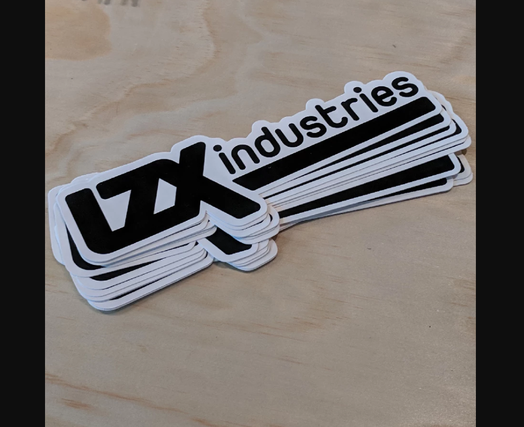
You can create a design where you put the name of your company along with the logo. This is the simplest form of design. On the other hand, you can ask a question and let people guess the answer. You can also use icons in case you don’t want to include any text whatsoever. However, you have to keep in mind that the icons or the text that you are using should have an impact on the audience. Check out the image above. You can see how the companies have used the different shapes to create the stickers.

Include your brand:

You should not forget the idea behind creating stickers. Your ultimate aim is to make sure that people recognize your brand. So, no matter what text you include or what typography you use or even the colors that you choose, you should never deviate from your brand identity. Your brand is not only the name of your company or the tagline that you use. Your brand is the typography, the color schemes, the tagline, the name and many other things.

When you are trying to create a sticker that should represent your brand, you should never use typography that contradicts with your brand identity. No matter what colors you choose, don’t use colors that don’t represent your brand. The idea of creating stickers is to increase the span of your brand. If you use anything other than what represents our brand, you are basically not creating any impact.

Let me explain with an example. Suppose you have used a shade of green and blue as your brand color. Now, it’s not ideal for you to use something that doesn’t relate to either of these colors. So, if you use pink or red to create your stickers, it may create conflict with your brand design. Similarly, if you have chosen modern typography for your brand logo design, there is no need to use calligraphy or comic fonts that don’t represent your brand.

Image courtesy: https://bit.ly/33PQILP

If you check out the stickers from Apple, you will see that the company has retained its brand value even when it has used multiple colors. How? The company has kept the design as simple as possible and that is what it is known for. It has not experimented with any other shape than its own logo, which is also a reason that you can recognize the brand.

Image courtesy: https://rdbl.co/2RoZgXv

Now, if you are not the owner of Apple, you have to take a different approach. Take a look at Heinz Ketchup sticker and you will understand that it’s not really difficult to capture the essence of your brand.

Call-to-action:

Call-to-action or CTA button is a part of your marketing efforts. Your website or social media pages or brochure or any other marketing asset must include a CTA button. So, the same theory applies when it comes to stickers as well. However, I have seen that many companies either don’t use CAT buttons or the CTA buttons that they use are not appropriate.

What is call-to-action? It is either a clickable image or a text that will ask the viewers to click take an action such as contact you or order your service etc. However, the CTA buttons that you can use on your websites are not applicable when it comes to stickers. It should be more understated

Image courtesy: https://bit.ly/2rZyn1T

When I say call-to-action, I don’t mean that you should use a sentence like “call us now” or “click here to contact us”. On the contrary, your call-to-action should be subtle. Your audience should not feel like they are being forced into taking action. Rather, the decision should be theirs to take.

So, what can you do?

Image courtesy: https://bit.ly/2sS5BRd

The first thing that you can do is you can include a barcode a barcode is the simplest way to capture the attention and driving people to take action, which is to scan the barcode. You can also create a sticker using a social media icon and add your social media handle as a CTA button. Keep experimenting with the CTA buttons. You can also hire professional designing company to help you out with innovative CTA buttons.

Choose CMYK instead of RGB:

While digital designs look good on RGB color scheme, print designs look good when used CMYK color scheme. Now, if you hire a professional graphic design company that has past experience in creating printable design, you don’t have to worry about the color selection. However, it is still important for you to understand why it is necessary for you to use CMYK instead of RGB.

Image courtesy: https://bit.ly/366s3nP

 RGB stands for Red, Green and Blue. CMYK stands for Cyan, Magenta, Yellow and Black. So, why should you use CMYK for your sticker design? The reason is that when you will print the design, the paper will absorb light. On the contrary to this, computer or mobile or any digital screen reflects light. So, when you print anything on paper, RGB color scheme can’t give you the best image that you expect. You get a better and more vibrant outcome from using CMYK color scheme for your stickers.  

Vector design for best results:

As I have already mentioned, you can create stickers that are huge in size as well as the ones that are to be stuck behind your mobile phones. So, if the resolution of the image is not good, can you imagine the disaster that will take place? When you will print the sticker, it will look bad.

Image courtesy: https://bit.ly/2LHOKHt

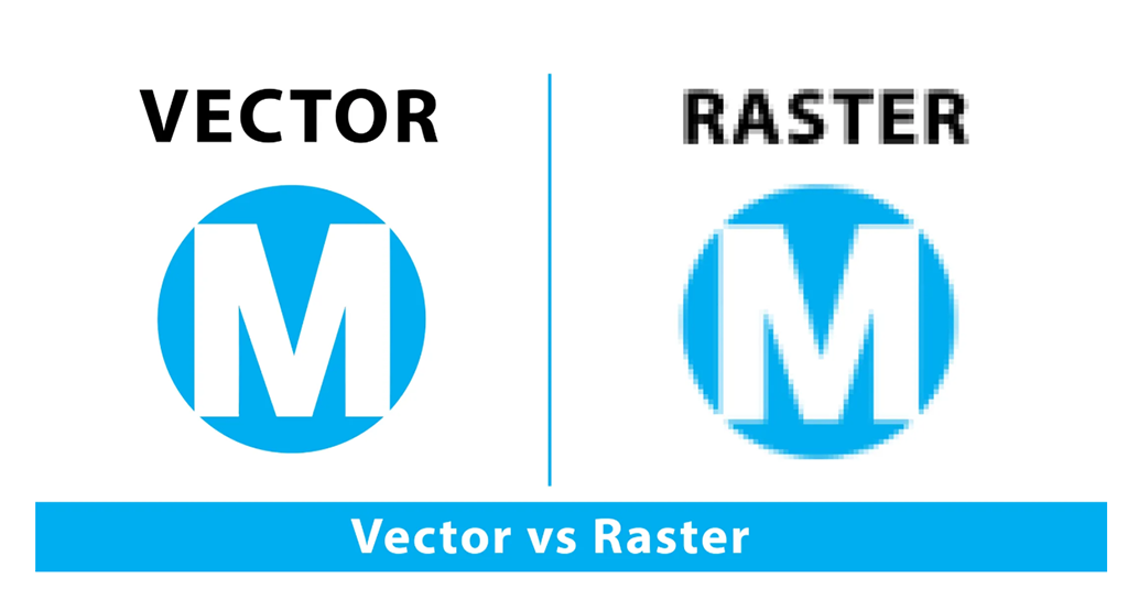
The best way to design your stickers is to create the design in vector. No matter how big or small your design is, you won’t have to worry about the image getting pixelated, in digital format or in printed version. Hence, the sticker can be printed for wall printing, t-shirt printing, coffee mug printing, laptop cover printing etc.

Keep the design simple:

If you take a look at the famous designs, you will notice that most of these are simple design. You may have already understood by the suggestion of using simple typography and writing less that the design shouldn’t look overcrowded. It’s petty to go overboard with a design when you have a lot going in your mind.

vector sale background

But you have to remember that your sticker is not where you can share the story of how your company started nor is it the right place to share the testimonials of your clients. You can take reference from other designs (obviously, don’t copy) and create a simple design that has originality.

How to print the stickers?

Whether you have completed the sticker design by yourself or you’ve hired a graphic design agency, your sticker design should be ready by now. Make sure that you complete all the changes and update the design so that it is ready to be printed by now. Follow the next steps to complete the process of printing. Even though you may think this step to be the most difficult, we will get it done together.

Choose the print material:

There are a few options when it comes to choosing materials where you can print your sticker design. However, most of the stickers are generally printed on vinyl, be it small or big. In some cases, the sticker can be printed on t-shirt material.

Now, for the vinyl stickers, you have to decide whether you want the sticker to be matte or glossy. While the glossy stickers will look shiny, the matte ones will be less shiny.

Image courtesy: https://bit.ly/2DSOgcV

You can either choose a colored vinyl for your plain stickers or you can choose a clear background for the customized stickers. The clear background shows the customized design without incurring the cost of cutting the stickers as per their shapes. You can also use clear vinyl so that the stickers can be used on transparent surface.

Set the size and resolution of the printing:

To get your sticker printed nicely, you have to set the resolution first. Even though you have designed the sticker in vector, while printing, you have to choose a particular size and resolution. You can choose inches or centimeters or pixels to determine the size of the sticker. 300DPI should be your ideal image resolution.

You also need to pay attention to designing the edges of the font so that it looks prominent when printed. You can either use Photoshop or Adobe Illustrator to flatten the edge of the fonts or you can hire a graphic design company that can help you with the design works.

Trim the border:

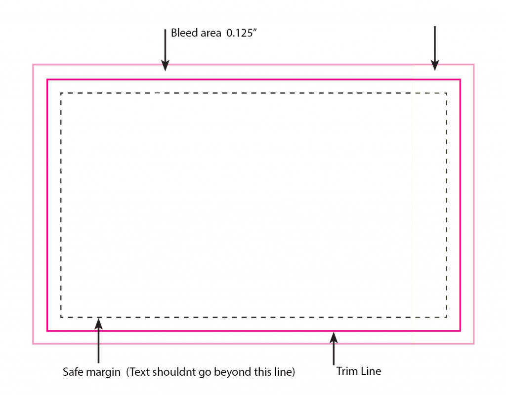
The last thing that is needed for your sticker design is trimming the borders of your sticker. You have to allow some area to bleed (3 to 4cms) and then trim. The bleed area allows you to trim the edges properly without ruining the sticker. The reason behind this step is to make sure that the design fits inside the given space and no part of the design or the text is cut off.

Image courtesy: https://bit.ly/2sJ3dvQ

Conclusion:

If you are new into designing and printing stickers, the process may seem intimidating to you. However, let me assure you that it is not that tough. However, expertise in this field will always play in your favor. If you have knowledge on creating designs or handling designing software, everything becomes much easier.

But you don’t have to worry if you don’t have acquaintance in designing. Nico Digital is here to help you out with the process. By hiring the company you can hire the professional designers working under the same roof for years. You can choose any pricing plan depending on your needs and rest assured that you will be delivered your task within the promised time.

Categories
Blog

Why You Must Almost Always Outsource Your Website Maintenance Work?

Let me ask you a simple question. Do you take your car to the service center for regular maintenance or do you handle the maintenance work all by yourself? I assume you take the car to the professionals. It is not because you can’t learn how to take care of your car. But the question is, will learning car maintenance help you in any way? The answer is NO.

The same theory applies when it comes to website maintenance. You don’t need to invest your time in learning how to maintain your website. You can simply outsource the maintenance work to a company that is dedicated to do that.

What did you say? You are not convinced yet? No problem. Here I have jotted down some of the benefits. You will understand why you must almost always outsource your website maintenance work.

Time saving:

Developing and designing a website is not enough. You have to maintain your website, keep it up to the date, get backdated links removed, and do a lot of other things – on a daily basis. It takes serious time. And dedication. You will need to hire professionals who can maintain your website.

There are many other things that you need to take care of when you are handling a business. Maintaining your website is definitely not one of those works. Hiring a professional takes time. Besides, you have to train the person to learn new technology. On the contrary, hiring a company that is dedicated to maintaining websites saves your time. Neither do you need to hire anyone nor do you have to waste time in implementing new techniques. Most small, medium and big companies follow this technique to maintain their websites.

Less expensive:

Believe me or not, outsourcing your website maintenance is much less expensive. Let me explain how. While you may think that you will maintain your website in-house, you have to hire professionals. I have already mentioned earlier that hiring is not all that you need to do. You have to make sure that you train these people properly so that they work in coordination as a team. You have to invest in tools and software to train the professionals and make them work. Besides, the wages of these people become a recurring expense for your company.

Image courtesy: https://bit.ly/38aoor1

If your company belongs to the first world country, hiring professionals from your local region is even more expensive. However, no matter where your company is situated, you can curb the expenses by outsourcing the maintenance work. Outsourcing is especially helpful and popular among companies that are situated in Europe or North America. Most of the companies outsource the work to companies that are situated in Asia and Africa. Since you get the desired service in low price, you can save a lot.

Get access to different types of talents:

If you plan to hire professionals for maintaining your website, you have to choose a couple of them from the available options around you. However, if you outsource the work, you get access to different types of talents. You can hire a company that has experienced specialists working with them.

It doesn’t mean that the employees of the company are experienced only in maintaining website. It means that the employees know development, design, maintaining and a lot more. It also means that these experts have years of experience in executing their work properly. In some cases, it is seen that people hire a company to maintain their website and invest in the same company to help them with other projects.

Many established companies outsource their website development, design and maintenance so that they get to know different points of view.

Company reputation and protection:

Your website is one of the marketing assets of your business. So, you have to make sure that your website not only works fine but also that it is not perceived as threat. Your website should not have any elements that can give rise to any doubts. It should also keep working 24×7. Technical glitches can make your website non-responsive, which can be a great downfall for your business.

Hiring a company to maintain your website ensures that the website works all the time. It also means that your website has some new elements being added from time to time. As a result, it remains trusted among the users and your company reputation is also saved. Besides, an updated website increases the chances of conversion.

Moreover, when you hire a company to outsource your website maintenance, you make sure that all the data is backed up properly and saved in a remote location so that you can recover the data whenever you want.

Round-the-clock service:

Generally, the companies that you might hire for outsourcing help you with round-the-clock support. Either the project managers are available over phone or you can contact them via messages and emails. Since there is a time difference between the European and Asian countries, the experts work when you sleep. There is a time difference of about 10 hours, the professionals start working while you are still not awake. It makes sure that you are operating in shared working hours.

Risk sharing:

When you are working with another company, you are sharing the risk factor with that company. The same theory is applicable to outsourcing as well. The risk factor associated with the maintenance and service of your website is also depended on the company that is taking care of the maintenance work.

You may think that you can hire in-house developer to take care of your website. However, it will only increase the pressure on your employees and your company. On the contrary, outsourcing will ensure that the other company takes care of your website to maintain their reputation.

Outsourcing is based on trust. So, every company will try and make sure that the business relationship lasts long. And that is why the expert developers will be attentive towards your company.

Flexibility to grow:

You may have started small when you started your business. But do you always want to remain a small business owner? No, right? So, why settle for a website that is basic? It is fine to start with a simple website. But that should not stop you from creating an extensive website. And that is why you should take website maintenance seriously.

Hiring a company that offers to maintain your website means you are hiring website developers and web designers. When you would want to expand your website, you will have the flexibility to grow. You don’t need to hire developers or hire another company for the scalability of your business website.

SEO benefits:

The more updated your website is the better your chance of ranking on search engines. Google and other search engines algorithms are constantly being updated. Ranking factors of websites continuously keep changing. Competition is pretty stiff nowadays no matter which field your business belongs to.

It is important to make sure that the site is optimized for the user experience and loads fast. While also ensuring that your website is considered to be adding value. And for that, you have to keep adding fresh content, be it images, articles, texts, videos, PDFs or anything else.

Focus more on the growth of your business:

Suppose you don’t outsource website maintenance. Instead, you maintain your website regularly. But, I have a question for you. What will you do when you need to go out of town regarding business? If not out of town, you may need to attend business meetings, get-togethers, business parties and other formal events. What will you do when you have to invest your time in the growth of your business? You won’t be able to invest time that is required to maintain your website.

We understand how important your business is to you and we also realize that you need to keep growing. That is why it is important for you to keep your focus on building and growing your business as a brand. That is where you need the support of an agency that takes care of your website maintenance.

Conclusion:

We live in an era when everything is being digitalized. Nowadays even the small business owners have their own website so that they are reachable by more people. Your work doesn’t end with creating a website. But you have to maintain the website, keep it updated, keep threats at bay, keep an eye on any security breaches and do a lot more. I have already pointed out why you need to hire an agency that is dedicated to take care of your website. It is always good to hire professionals who not only know what they are doing but they also know how they are doing it rightly.

Nico Digital has been maintaining the websites of its esteemed clients for so many years. Our first priority is the maintenance of your website. We have monthly schemes to choose from to fulfill your need. If you want to know more about how we can help you, contact us.  

Categories
Blog

How To Get An ROI From Your SEO Effort?

What is the reason behind your SEO efforts? Let me answer the question for you. The reason behind your following search engine optimization is to make sure that the traffic in your website increases. Whether your SEO efforts are showing result or not can be understood if you track your ranking and the search traffic. Better ranking and more traffic mean better revenue as well.

However, the problem is that you can’t really decide upon a particular amount that will determine your success in SEO. So, how will you get return on investment or ROI from your SEO effort? And how will you understand that you have reached your target?

The simple answer is that you have to calculate the ROI to determine whether your SEO technique is working or not. Here, I have discussed a few steps that you can try out to get an ROI from your SEO effort. So, let us get started.

Ecommerce website vs. lead-based website conversion:

You have to understand that conversion tracking and ROI of an ecommerce website is not similar to a lead-based website. Ecommerce websites are different from lead-based websites. While you can sell products or services directly through an ecommerce website, you can collect potential customer leads through lead-based websites.

So, an ecommerce website will collect customer data from the transaction that is happening on the website. On the contrary, a lead-based website will have to depend on paid tools to find out the conversion rate.

There is simply no doubt that it is easier to determine and increase the ROI of an ecommerce website. However, it is also possible that a lead-based website can determine and increase its ROI. How? Here’s how:

Track conversion:

You have to create a set-up for measuring the conversion rate. The process for measuring is different for lead-based website and ecommerce website.

  • Lead-based website

When it comes to lead-based website, tracking the conversion becomes a bit complicated. You don’t really have any transaction happening on your site. However, the approach in this case is different. You have to check out what actions the visitors on your site are taking. So, suppose some of your potential clients are reading your blogs while some are filling up the contact form to get more information.

We will mark each lead having a worth. So, if someone signs up for your newsletters, that person will be worth $50. Someone who wants you to contact him/her is worth $100. There is a simple technique to determine the worth of your clients. Let’s check that out.

Since it is easy to calculate with a round figure, we will assume that you get 100 fresh newsletter subscribers each month. If 20 among them hire you for your service, you can say that the conversion rate is 20%.

Image courtesy: https://bit.ly/34WCNVE

Now, suppose each of these 20 people is spending around $300 to avail your service. So, the average value of each of these 20 sales will be $300. The final step is to determine the value of each of the leads. You have to divide the total number that you make from the amount spent by your converted clients with the total number of leads.

So, the total amount that you get in this example is 20 (people) X 300 (dollar each) = $6000.

Now, divide the total amount with the original number of leads, which are 100 people in this example. So, the average value of each of the 20 clients will be 6000/100 = $60.

So, once you have chosen the worth of each of the potential clients, you have to treat them as your goals. There is a section in Google Analytics, which is named as ‘goals’. Include your ‘goals’ in Google Analytics ‘goals’. You will see a value marker in ‘goal details’. Once you start including each of the ‘goals’, it will become easier for you to calculate the return on your investment because you will get some tangible data with you.

  • Ecommerce website

Tracking your ROI for ecommerce website is much easier. You have to take help from Google to track your website. Even if you haven’t invested in SEO and nor do you plan to do so, enlisting your website on Google will help you in measuring your success or failure.

Once you have set your tracking details, all you have to do is check out the information regarding the conversion rate. Follow this by the transactions, the average value of orders and the total amount of revenue.

This process will allow you to find out the exact number as in revenue generated by your SEO efforts. If you need help with the process, Nico Digital is always there to help you out.

Analyzing the data:

It takes a couple of months to track the conversion on your website. Now, you can start examining the collected data to see the ROI that you are getting from your SEO efforts. Google Analytics conversion report will let you know the exact number of conversions that you have gotten from organic search, social media, paid search, referrals, newsletter and any other source.

Google Analytics will not only show you the number of conversions but also the value of the generated revenue. Now that you have a real number, you can compare it with the amount that you have spent on SEO for this particular time span. Even though this will not give you an exact number that you can term as ROI from SEO, you can obviously start to notice the acceleration.

Suppose your total revenue is $100,000. You have spent $25,000 in paid search, keyword research and content generation. So, your ROI is $75,000. Now, you have to find out the revenue that has come from organic search, from social media from paid search, individually.

It’s time to calculate now:

This is the easiest part of the whole process. You just have to follow a simple formula to calculate the percentage of your ROI. Here is the formula that you need to follow:

{(The amount you gained from your investment – The amount you spent as your investment)/ the amount that you have spent as your investment} X 100

So, the equation will look like:

So, the percentage of your return on investment is 300.

While the percentage may or may not be satisfactory to you, it is definitely not the time to stop, right? You have to keep growing and increase the return on your investment. Now the question is how you can increase your ROI from your SEO efforts. We’ve got you covered in that. Here are a few things that we recommend doing:

Location-wise audience targeting:

No matter what type of business you own, you first need to target the local audience. SEO works best when you apply it locally. Even if your target is to go global, you must take baby steps. Believe me most big companies have come to realize that a business can’t grow big without targeting the local audience. When you dedicate your SEO efforts to targeting a specific location, the results of the efforts will show better.

Try and improve the Click-through Rate:

Click-through rate is the proportion of people who click on a particular link on your page in comparison to the total number of people that have viewed the page. The click-through rate determines the success of your website. The better your CTR is the more your SEO efforts will show results.

Image courtesy: https://bit.ly/2YjM1sL

So, one of the most effective ways of improving your ROI from SEO efforts is to ensure that the CTR increases. You have to design your SEO efforts in such a way that more and more people, who visit your website, click the links that you share. Try changing the title of your blog; try and make the call-to-action button clearer and understandable; use an updated SERP snippet, etc.

You need to research on what the ways are that can help you improve your SEO efforts.

Where can we help?

Whether the whole process sounded simple or complicated to you, you have to follow the process attentively to get the best possible results. You need to calculate the ROI properly. You also need to conduct a thorough research on how you can improve your CTR. You also have to find out why your SEO efforts are not giving the desired results and act upon that to ensure that you get the best ROI possible.

And that is where we come to help you out. We not only conduct a thorough research but we also make sure that we keep improving the content on your website. We keep your website updated and keep on looking what improvements we can make. The best part is you can rest assured about the success of your SEO efforts when you hire us. Your ROI is our responsibility. So, what are you waiting for? Contact us for more information in this regard.

Categories
Blog

Why Choose WordPress Over A Pre-Coded Site?

There are many companies which use WordPress to create their business websites. However, if you are new into the world of WordPress, you may ask the necessity of using this platform. You may think that your old custom-coded website is working fine and you can carry on with that. But if you want to re-design your website and make sure that you add something fresh, you can give WordPress a try. Why? Check out the reasons why WordPress is the answer for your website design.

WordPress is completely free:

 Believe me when I say that WordPress is completely free. The software allows you to download, modify, install or use any of its features without any cost. However, there’s one thing that you have to remember. While WordPress is free, you have to purchase a domain name and web hosting to install your domain on WordPress. You can also get the paid version of WordPress to get more benefits.

What is a domain name? A domain name is the name of your website. It is the name that people search you with. So, the name that appears on the address bar is what the name of your domain is.

Web hosting is the place where the files are stored. There are many webhosting sites. However, Bluehost is the most popular among those and for good reason. So, I would recommend you to invest in Bluehost. If you are lucky enough, you can end up getting a cheap deal as well.

Image courtesy: https://bit.ly/2RmU9Hg

Since you get to choose from a number of themes in WordPress, you can create a customized website with zero investment. On the contrary, you may need to invest additional amount on a custom-coded website to create a theme as per your requirements. WordPress is also custom-coded website. However, the codes are already written for you.

If you are not confident about hosting your own website on WordPress, we are here to help you out with that.

Saves time:

When you are designing a website from scratch, it takes time. The developers need to code your website as per your requirements. The website needs to go through trial and error to see whether every feature is working or not. Usually, it takes weeks and sometimes months to make your website go live depending on how extensive a website you want. Besides, it also requires that you hire at least a website designer and a website developer.

On the contrary to this, WordPress allows you to make your website live within minutes. You can make moderations as you wish. Since the coding is already done, all you need to do is use your content.

Get SEO benefits:

I will try to explain in simple words why WordPress offers SEO benefits. As I mentioned earlier, WordPress is created with pre-written codes. Now, these codes are high in quality and they allow search engines crawlers to crawl easily. Hence, it is much easier for WordPress websites to rank on Google.

If your website is made on WordPress, chances are your website will rank higher than usual given that the content you provide is also superior. So, you can understand that WordPress websites are SEO friendly and they provide the best SEO results that you can expect from your website.

The best part is that you don’t have to settle with what you get. You can further optimize and get even better SEO results with WordPress plugins for SEO. If all of these are overwhelming for you, you can always look for help.

Multiple themes to choose from:

Most of the websites that you see when you search are made on WordPress. And trust me, most of the owners of these websites are neither programmers nor are they web designers. So, it can be assumed that these owners don’t know how to design a website. So, how do they manage to create the outstanding websites that not only look good but also work well?

WordPress has many themes to choose from. No matter what type of website you have, WordPress has at least one theme on that. I mentioned before that WordPress allows you to customize without any cost. So, you can customize your website depending on what you want it to look like. You can change the colors, the background, your company logo, etc. You can add sliders, hamburger menu or other details that you want.

Image courtesy: https://bit.ly/33WndIe

You can also add contact forms, blog page, career page and many other pages within your website. Depending on the plugins that are available on WordPress, you can add more functionality.

Safety is pivotal:

When you are creating an official website, the last thing that you need to be worried about is the safety of the website. However, as we all know, internet is not a safe place to be. Many websites have been hacked and important information has been stolen. But when you use WordPress to create your website, you can rest assured about the safety of your website.

I recommend checking the security guide on WordPress to know how you can ensure safety of your website. The security guide on WordPress will allow you to keep malware and Trojan horses at bay.

Include different media:

If you have been thinking that WordPress is about adding written content only, I am sorry to say that you are not right. You can also include audio files, images and even videos. WordPress also allows you to embed YouTube videos, Tweets, Instagram profiles, SoundCloud audio files etc. You just need to paste the URL of the video or audio or photo that you want to use in the editor in WordPress.

Ease of using:

If you are looking for website that is easy to manage, WordPress allows you the same. It has an update management system which is built-in. Hence, you cannot only update themes but you can also update the plugins that you use. WordPress keeps updating itself and it keeps notifying you about the updates. As a result, it takes just a click to update your website on WordPress.

As I mentioned already, WordPress is secure to use. If you are worried about keeping your data secure, you can also create a backup using a plugin. You can store the backup somewhere safe so that you don’t have to afraid of losing anything.

Conclusion

No matter whether you have a simple website or you want to build an ecommerce website, WordPress allows you to do anything, yes anything. So, what are the ways you can explore WordPress? Here are a few examples that you can try out.

Firstly, you can start an online store where you can offer products or service directly. Secondly, start a business website that allows you to connect with people without selling your product or service directly. If you like writing or you are passionate about something that you want to share with the world; you can start blogging on WordPress. There are many types of websites that you can create on WordPress.

If you are not sure whether you can design your own website on WordPress, you can always contact us – Nico Digital. We have professionals with years of experience working with us. So, you get the best support possible from our side.

Categories
Blog

Examples Of Good And Bad Email Signatures

Would you believe that people actually read and enjoy reading emails that have good email signatures? It is true that good email signatures can create an impact on your target audience. Now, you might be thinking whether your email signature is good or not, whether it is compelling or not. Well, worry not. I am here to show you what good email signature looks like. I will also give you some examples of bad email signature so that you understand what you should avoid. If you want to know how you can create email signatures that create an impact, check out the article here.

Coming back to where we were. I will give you examples and explain why certain email signatures work and why the others fail. So, let’s not waste any time and get started with the email signature design. I will show you one good example and one bad example so that it’s easier for you to compare them.

GIF email signature:

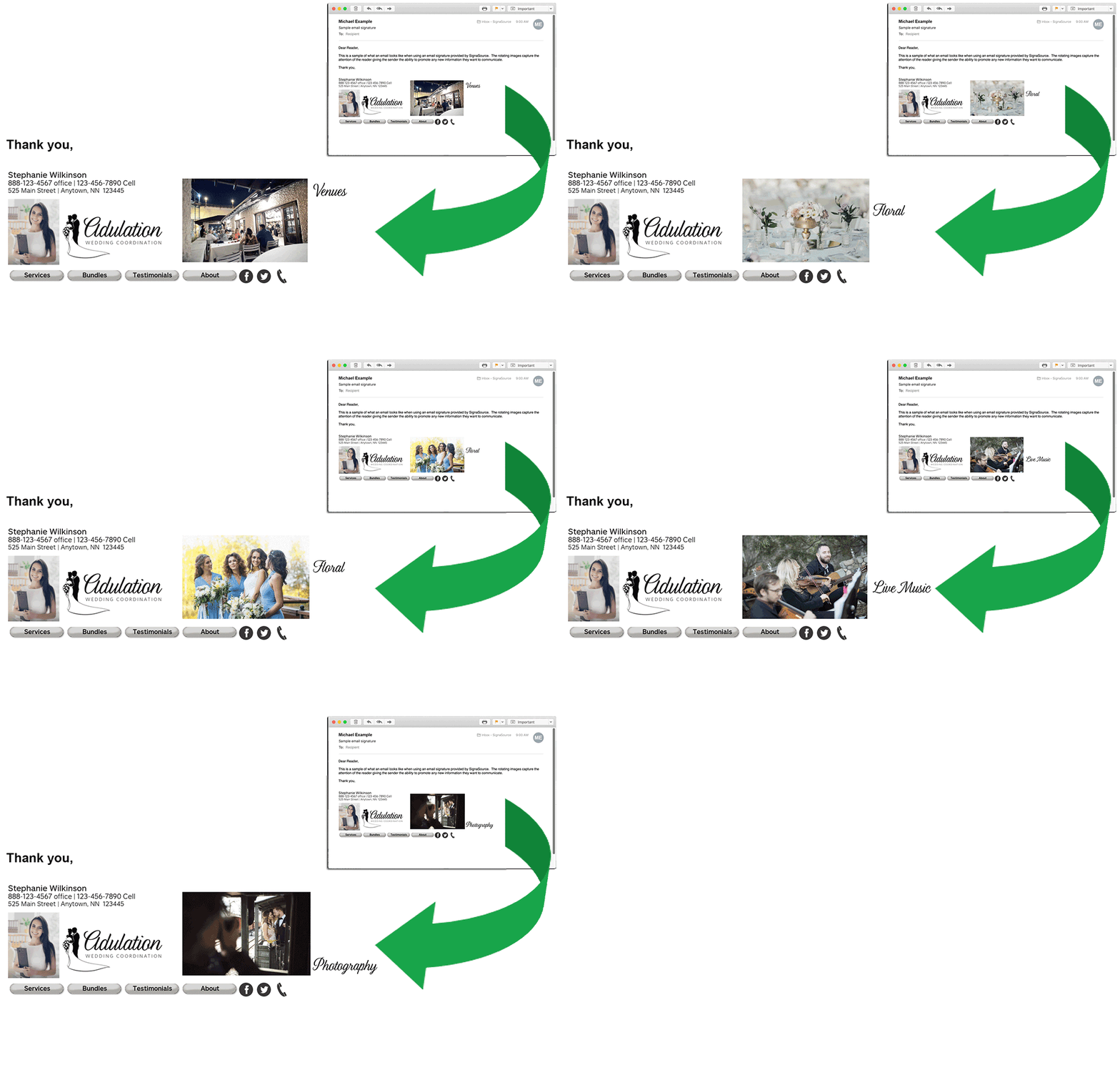
The first thing that you can do is to create a GIF email signature design. Why would you use a GIF, right? Well, you can include a couple of photos of the products or the service you offer. People who get an email from you can get a glimpse of what you do. The best part about this is that the email doesn’t become heavy since the photos will appear in the form of GIF. Take a look at the email signature below.

Image courtesy: https://bit.ly/2L4He9g

Here’s one more example that you can take a look at. It’s amazing how delicious the chocolate looks when used in the GIF format. Isn’t it mouthwatering?

Image courtesy: https://bit.ly/2OyLKyZ

Even though I don’t recommend linking all your social media handles in the email signature, the above example is an exceptional. Do you see how seamlessly the social media handles merge in the design? It doesn’t even look like the owner has cramped the space. On the contrary, it appears that you can connect with the owner of the email at different social media platforms.

Besides, you can see all the necessary information placed properly along with an image of the sender. Since the owner of the email signature doesn’t belong to a hardcore professional background, her perky image doesn’t even look out of place.

Image disaster in email signature:

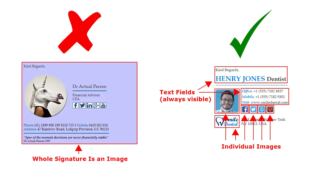
While I just informed you that you can use multiple images (like the images above), make sure that you use the images in the right way. Take a look at the example below and then I will explain you what the problem is and why you should avoid doing the mistake.

Image courtesy: https://bit.ly/2XZEE9r

There are two images in the above example. While the left (your left hand) image is an image only, the right one is the RIGHT one! Pun intended!

The left side example has all the necessary information in an image form. It seems a good idea, right? Wrong. Why? The first problem with this design is that it may take long to load if the internet connection is poor. So, people may not even get to know whom they are receiving the email from. Besides, it may make the email heavy with an additional image.  Secondly, the social media links or the website address that you share in the image form is not clickable. So, if someone liked your email and wants to visit your website, they can’t click on the links. The same problem will occur if someone from your contact list wants to copy paste the name or contact info of your company. Moreover, if you ever need to change anything, whether it is address or the contact number or anything else, you won’t be able to do that. You have to create an all-new image with the new information, which to me is unnecessary time consumption.

So, what is the right way of doing this? Instead of creating an image file with all the information, it is better if you create individual images along with texts. Your headshot should be an image. The social media links that you share should be imposed on individual images so that each of the social media links can be clicked.

However, your name, designation, contact information and other necessary info should be written in text format. It will allow you to change the info quickly and will also allow the recipients to share the information by copy-pasting.

Include images and video links:

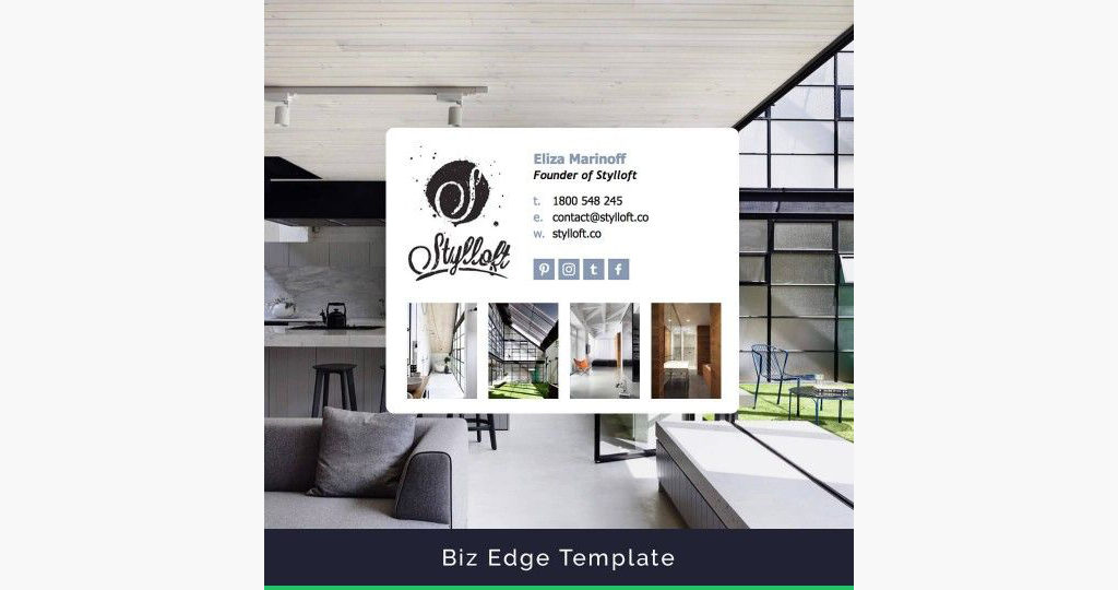
You might be thinking that I just told you not to use image in the email signature and now I am asking you to use images. I asked you not to include the essential information in the image format. However, it depends on you whether you want to use images in your signature or not. Suppose you are a photographer or an interior designer or a makeup artist. You can show off some of your outstanding work examples using a couple of images. Don’t use images that are too large to load. Take a look below:
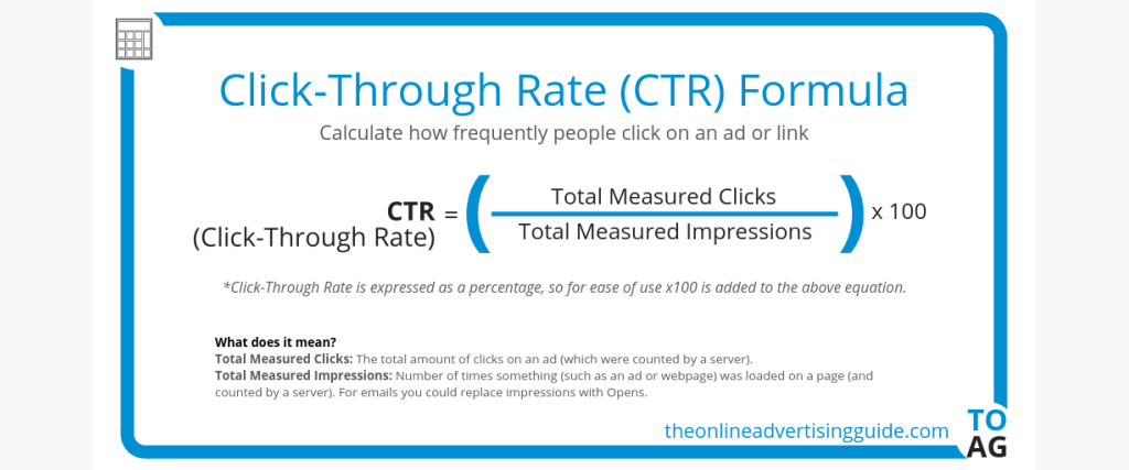
Image courtesy: https://bit.ly/33u9I2t

As you can see, this is an example of an interior designing company. The company shows some of the works that it has done in the past. Since there are images in the email signature, the rest of the design is kept as simple as possible.

You can also share some of your video links. It will work just how you share your social media handles. However, I recommend hiring an email design agency to get a professional design. Let’s see how it will look if you share the links of your videos.
Image courtesy: https://bit.ly/37MHcfD

The images with video symbol are actually nothing but thumbnails. However, each of the images contains the links to the related videos.

Too large social media icon:

Sharing your social media handles is necessary to create an email signature. However, in some cases, you may see that the social media handles are too large. The design not only looks bad but it also doesn’t serve the purpose of being an email signature.

Image courtesy: https://bit.ly/2L4b39M

Image courtesy: https://bit.ly/2Dtlu2w

Your email signature should highlight your name, designation, the name and the logo of the company that you represent. The social media links are secondary. However, creating large social media icons takes away the focal point from the company name and logo.

Short and precise email signature:

Your email signature should never be more than three or four lines. The more precise you can keep it the more attention it will grab. You don’t need to include too much information. Primarily, adding your name, company name, designation, address and phone number is all you need. You can add the address and the phone number in the same line.

You can experiment with the alignment. Keep the logo of the company on the left and the information on the right. You can try out placing the information in such a way that it doesn’t look clumsy and yet all the necessary information can be added. Check out the example below to draw inspiration from it.

Too long signature:

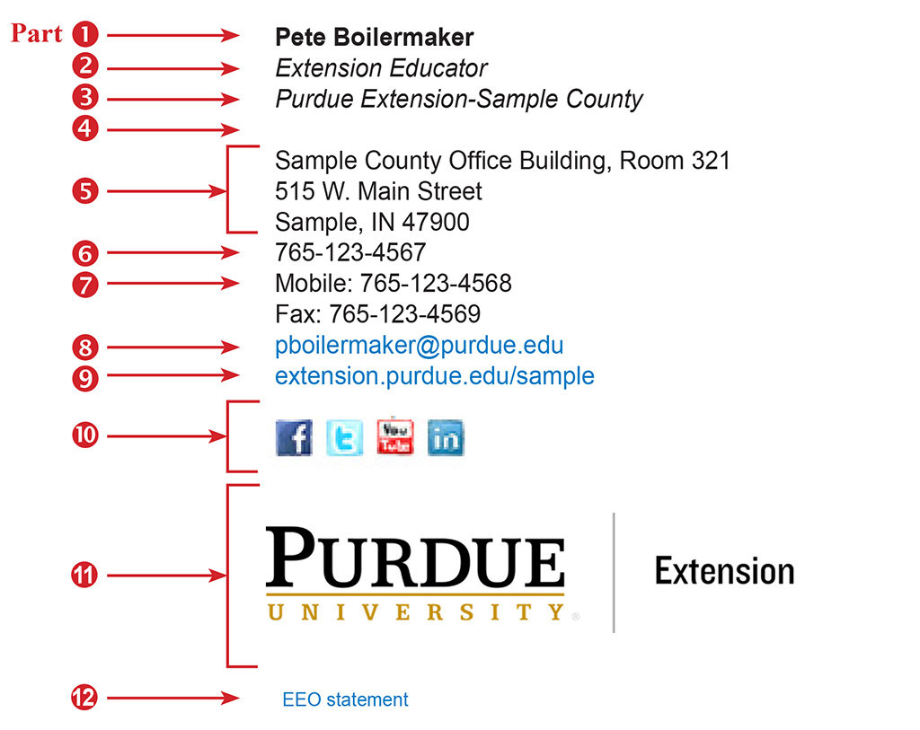
There are some people who like to break the information in multiple lines. While it may seem a good idea, it makes the email signature look too long. Some companies follow the long structure. But I don’t recommend using that structure.

Image courtesy: https://bit.ly/35HCLRB

I agree that the font used is quite big. But even if you reduce the size of the font or you use a different font, the email signature is too long. Just imagine someone reading this in their mobile device! It will be such a pain-stricken situation. If you really need to include so many sections, take idea from the above example. Align the pieces of information in such a way that it doesn’t look too long and yet you can share the necessary info.

Mobile-friendly design:

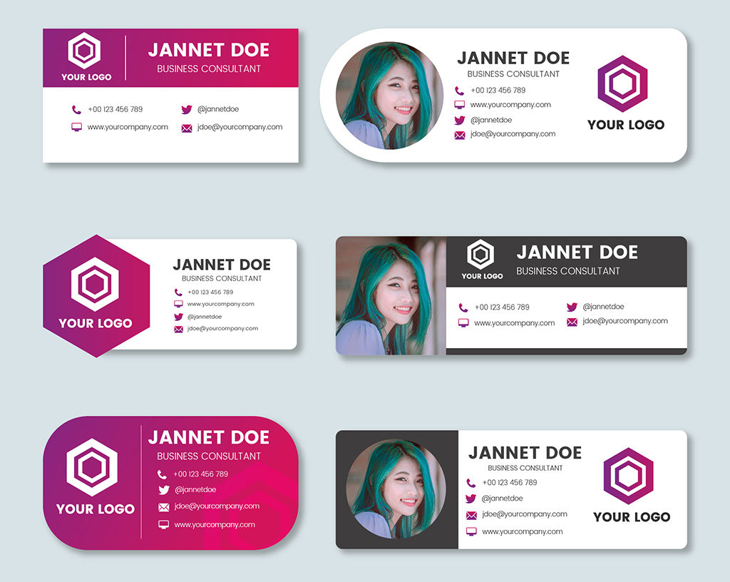
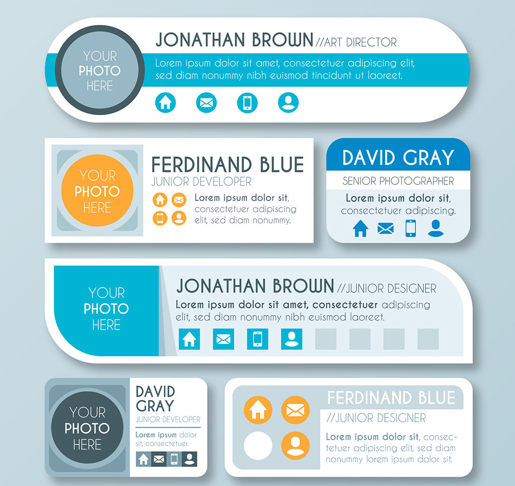
Most of us check our emails from our mobile phones or tabs when we are one the go. So, the email signature that you use should be mobile-friendly. By mobile-friendly I mean that it will be short and compact. You don’t have to skip any piece of information and you don’t have to add any additional piece of information.

As you can see from the image above, there are multiple ways that you can use to place all the essential information. These are templates that you can follow. Each of the templates is mobile-friendly as they don’t take much space. You can hire a graphic design agency that will help you to create email signature that is good for mobile devices.

Long disclaimer:

I have received many emails from various companies where the disclaimer is placed right below the email signature. Even my own company email signature contains a disclaimer just to make sure that I am legally safe. However, there are some companies that write disclaimers that are too long. In some instances, even copyright information is shared!

Image courtesy: https://bit.ly/2Otjmy3

I agree that the disclaimer helps in keeping legal issues at bay. But you have to understand that disclaimers at the end of your email signature won’t really help you much. So, you don’t need to include all the legal messages in the email signature design. Instead, use a line or two if you really need to include disclaimer. If you don’t want to include disclaimer, that is fine too.  You can skip that part.

What is the best way to create email signatures?

You can use the free tools to create an email signature for your personal use or your company. However, the free tools don’t provide a unique finish that you look for. On the other hand, hiring an email signature design agency can give you a professional email signature.

Nico Digital is a full service digital marketing design company that handles any type of design related work. You can be rest assured that your email signature will look classy and will have every piece of information that you want to share. If you have been planning to create an email signature of your own, this is the right time to do so.